A world map invites a particular kind of trust. Colour in every country and the eye assumes someone measured every country; that the shading reflects 195 individual data points rather than a handful of real ones stretched to cover the rest. Most “AI exposure by country” graphics now circulating make exactly that implicit claim. It doesn’t hold. The IMF’s exposure figures, the ones nearly every outlet cites, are built from labour-force microdata in six countries. Everywhere else on the usual map is a regional average, grouped only by income level.
Disaggregate those six real measurements and a second problem appears. “Exposure” doesn’t mean job loss; it means task overlap with AI capability, split roughly evenly between automation risk and productivity-boosting complementarity. On that measure, the United Kingdom ranks near the top of the world. Switch to the OECD’s narrower automation-risk index and the UK drops near the bottom of its 38 members. Same country, opposite headline. The mechanism is the definition being used, not the country being described.
Mapped: The Countries Most Exposed to AI at Work
Only six countries have published data on this. Here is what it actually shows, and where the data runs out.
A 70% exposure score isn’t a prediction of 70% job losses
The headline number invites a displacement reading on sight. Disaggregate the UK’s 70% and roughly half sits in high-complementarity occupations – work AI is positioned to assist, not replace – and the US’s 60% splits almost identically. The 70% and the 60% are measuring overlap with AI capability, not a forecast of redundancies. Complementarity is the variable the headline collapses.
Singapore’s 77% is high for a reassuring reason
The instinct is to read the highest score on the chart as the most dangerous. Singapore’s number is highest because a comparatively small share of its workforce sits in low-skill roles, and a comparatively large share sits in managerial, scientific, healthcare and legal work – the occupation categories that score high on complementarity, not low. Exposure here tracks occupational structure, not technological vulnerability.
The Philippines breaks the income story
The assumption embedded in most coverage is that emerging-market workers face mostly automation risk while advanced-economy workers face mostly augmentation. At 33% exposure, the Philippines sits roughly where its income bracket would predict – but around 60% of that exposed group is rated high-complementarity, a better ratio than either the UK or the US manage. Complementarity tracks occupation mix and task design. It doesn’t track GDP per capita.
The UK holds two contradictory rankings at once
The popular framing assumes a country has one AI risk level. It doesn’t, not on paper. Under the IMF’s exposure measure, the UK sits near the top of the table. Under the OECD’s narrower automation-risk measure – built on a different skills threshold entirely – it sits near the bottom of 38 economies. These aren’t competing estimates of the same thing. They’re answers to two different questions wearing the same word: exposure.
Methodology note
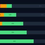
This chart combines two distinct datasets and does not present them as directly comparable. Country-level exposure figures (the six bubbles) come from IMF staff research applying AI Occupational Exposure (AIOE) methodology – developed by Felten, Raj and Seamans, extended for complementarity by Pizzinelli et al. – to national labour-force microdata: the UK Labour Force Survey and US American Community Survey (Cazzaniga et al., IMF Staff Discussion Note SDN/2024/001, January 2024); Brazil’s PNADC and India’s Periodic Labour Force Survey (also SDN/2024/001); Singapore’s 2022 resident labour force survey (IMF Article IV Consultation, Selected Issues, 2024); and the Philippines Labour Force Survey (Cucio and Hennig, IMF Working Paper 25/043, February 2025). “High exposure” indicates an occupation’s tasks substantially overlap with current AI capability; it does not indicate predicted job loss.
The three benchmark bars (advanced economies, emerging markets, low-income countries) are unweighted averages across 125 countries by income classification, from the same IMF research programme.
The OECD comparison referenced in the text uses a separate methodology – the share of employment in occupations requiring more than 25 of 100 skills classified as easily automatable — from the OECD Employment Outlook 2023, covering 38 member economies. It measures a narrower concept (automation probability) than the IMF’s exposure measure, and the two should not be read on the same scale.
Chart published June 2026. We’ll update it as new country-level IMF or ILO exposure studies are released.